Themes
One theme, three modes. Every sitemd site includes light, dark, and paper — designed together as a cohesive system.
The three modes
Light
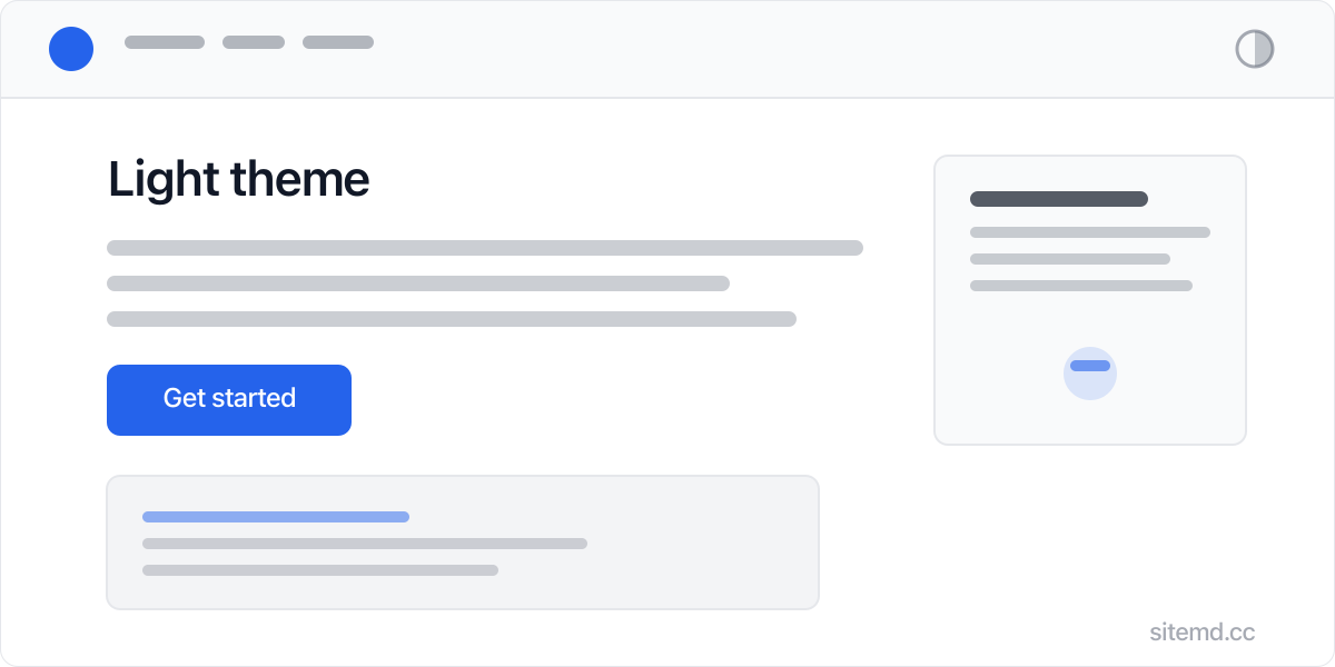
Clean and modern. White background, high contrast text, blue accents. The default for daytime browsing.
Dark
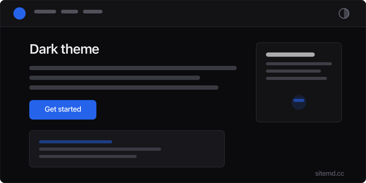
Refined, not inverted. True dark background with carefully tuned text colors that reduce eye strain.
Paper
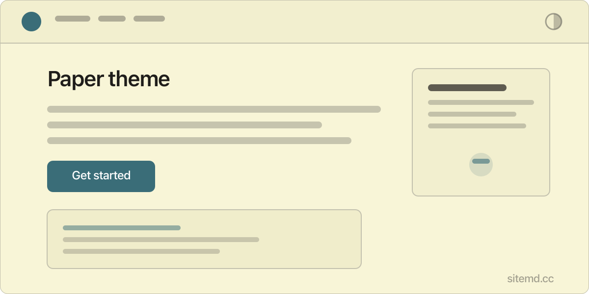
Warm and editorial. Cream background with teal accents. Feels like reading a well-designed newspaper. Perfect for long-form content.
Theme settings
All theme configuration lives in settings/theme.md:
# settings/theme.md
defaultMode: system
accentColor: #2563eb
fontSans: Inter, system-ui, sans-serif
fontMono: JetBrains Mono, ui-monospace, monospace
contentWidth: 720px
pageWidth: 1120px
radius: 6px
imageCorners: subtle
| Setting | Default | Description |
|---|---|---|
defaultMode |
system |
Starting mode: system, light, dark, or paper |
accentColor |
#2563eb |
Brand color for links, buttons, focus rings. Hover variant generated automatically |
fontSans |
Inter, system-ui, sans-serif |
Body font stack. First match wins |
fontMono |
JetBrains Mono, ui-monospace, monospace |
Code font stack |
contentWidth |
720px |
Max width of article content |
pageWidth |
1120px |
Max width of the full page layout |
radius |
6px |
Border radius for buttons, code blocks, cards |
imageCorners |
subtle |
Image corner rounding: none, subtle, or curve. See Images |
How it works
The theme system uses CSS custom properties on the <html> element:
<html data-theme="light">
Switching themes changes the data-theme attribute, which swaps all color values through CSS. No JavaScript frameworks. No class toggling on every element. One attribute change updates everything.
Visitor behavior
- System default — sitemd checks
prefers-color-schemeand starts in the visitor's OS preference - Manual toggle — The header button cycles through light, dark, and paper
- Remembered — The visitor's choice is saved in
localStorageand persists across visits
Customizing colors
Each mode has its own color block in settings/theme.md:
# settings/theme.md
light:
  color-bg: #ffffff
  color-text: #111827
  color-accent: #2563eb
  color-accent-hover: #1d4ed8
  # ...

dark:
  color-bg: #0b0b0e
  color-text: #ececef
  color-accent: #2563eb
  # ...

paper:
  color-bg: #f8f5d7
  color-text: #1f1d1a
  color-accent: #3a6d78
  # ...
Every color token is available per mode. Change any value and save — the site rebuilds automatically.
The full set of tokens in each mode:
| Token | Controls |
|---|---|
color-bg |
Page background |
color-bg-secondary |
Card/section backgrounds |
color-bg-tertiary |
Subtle backgrounds |
color-text |
Primary text |
color-text-secondary |
Muted text |
color-text-tertiary |
Faintest text |
color-border |
Standard borders |
color-border-light |
Subtle borders |
color-accent |
Links, buttons, focus rings |
color-accent-hover |
Accent hover state |
color-accent-subtle |
Accent tint for backgrounds |
color-code-bg |
Code block background |
color-code-text |
Code block text |
color-header-bg |
Header background (supports transparency) |
shadow-sm |
Small shadow |
shadow-md |
Medium shadow |
Typography
Fonts are configured in settings/theme.md. Bundled .woff2 files live in theme/fonts/. To use a different font, add its .woff2 file there and update the font stack:
fontSans: Inter, system-ui, sans-serif
fontMono: JetBrains Mono, ui-monospace, monospace
The first font in the list that's available is used. System fallbacks ensure text always renders instantly.
Layout
A single layout.html in theme/ handles all page types. It's a plain HTML template with placeholder tokens that the build engine replaces.
Sidebar rendering is automatic — pages that belong to a group with a sidebar location (configured in settings/groups.md) get a two-column layout with sidebar navigation. All other pages get the standard single-column layout. No separate template file is needed; the same layout handles both. See Groups for how to set up sidebars.